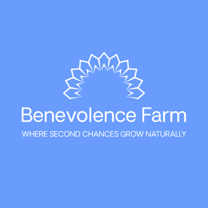
You may have noticed that we have a new logo, font, and color scheme. After over ten years of using our original logo, we came to a point where both our non-profit and social enterprise needed to evolve.
Where it started
Benevolence Farm adopted the original logo, created by Maxine Mills, after establishing the mission and vision of the organization and consulting with numerous stakeholders. The design represented strong women, growth, community, nature, freedom, and celebration. The colors came from some of the original marketing our founder had done since the inception of the idea — brown to symbolize the earth, green to represent leaves and growth, and the energizing color of orange.
Where we’re going
The new logo, created by Lisa Wong, incorporates a sunflower. Sunflowers are heliotropic, meaning the flower grows and turns to the sunlight. As part of our collaborative design process with residents and alumni, the sunflower captures the sentiment that, at Benevolence Farm, we are all constantly growing towards a brighter future.
Additionally, our residents resonated with the crown-like shape of the sunflower logo. They love to refer to one another, and our chickens, as queens. We are royalty, after all.
Our color change to yellow and blues represents our two favorite colors seen on the farm: sunflowers and blueberries. Blueberries are an important part of Benevolence Farm. From the very beginning, we have dedicated a blueberry bush to every incoming resident. Now our orchard is so large, it represents all those who have yet to arrive!
Over the next few weeks, you will notice a shift to the new logo, fonts, and colors on our website, social media, print materials, and enterprise packaging.
We are excited to evolve and grow as we pursue our vision of a world where prisons no longer exist and everyone’s basic needs are met.

